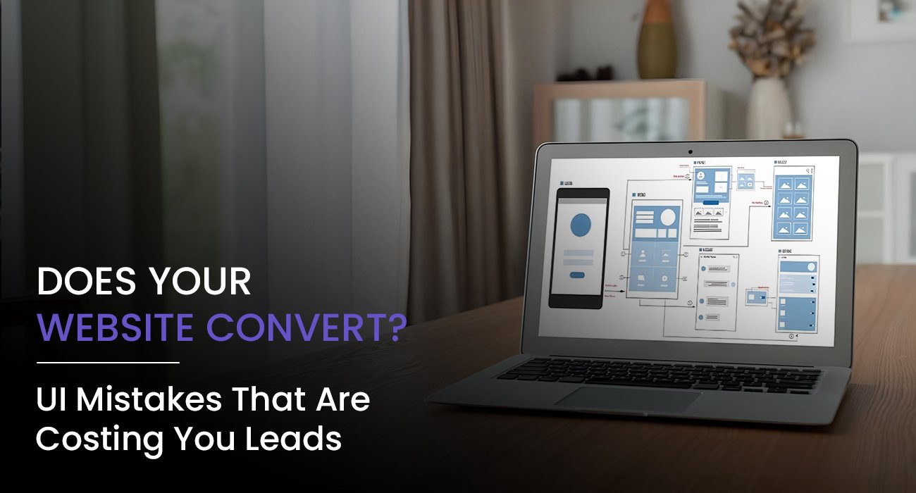
If your website is receiving traffic but your inbox is still empty, it’s not a visibility problem. It’s a conversion problem. And more often than not, it’s your UI that’s to blame.
Your website may look great to you. But if your users are confused, lost, or unimpressed within the first few seconds of arriving on your site, they’re not going to say a word and simply leave. No contact form. No sign-up. No sale.
So, let’s take a look at what is costing you leads without making a sound, and how you can fix this by simply making your User Interface smarter, cleaner, and more helpful.
First, what is UI?
UI stands for User Interface. It includes the visual and interactive layer of your website. Think buttons, menus, layouts, colors, spacing, and all the tiny design details that inform how someone feels when they land on your site.
If your UI is solid, your website will be easy to use, beautiful to look at, and conversion-friendly. When your UI is clunky or confusing, no amount of quality marketing strategy will save you.
The seven UI errors that slowly kill your conversions
Your design looks like it belongs in an archive
If your website looks like it was built when selfies were new, users will click out of your site faster than I can say “homepage.” Outdated design screams neglect. People trust modern, feel-good design.
Fix it
Take advantage of clean layouts, modern typography, a balanced color palette, and enough white space to breathe. Design with mobile in mind because your audience is already scrolling.
An unclear call to action
If your visitors don’t know what to do next, they’ll do nothing. Having a non-existent call to action or a generic one makes your website a dead end.
Fix it
Make your call-to-action buttons bold, specific, and benefit-driven. Use phrases like Book Your Free Demo or Get My Quote Today. Make it easy to notice, not just at the end, but throughout the page.
Your site takes too long to load
When your website is taking too long to load, you are losing potential leads with every extra second. Nobody waits, especially your next client!
Fix it
Compress your images. Use a performance-oriented host. Eliminate needless plugins. Every second you save adds up to trust.
Navigation is a maze
If users are unable to find what they want within a few clicks, they will move on. They will leave.
Fix it
Streamline your menu. Limit the top-level navigation to the essentials. Take advantage of user-friendly labels like Services or About instead of clever ones that leave users wondering.
Walls of text without a visual flow
Too much text is as bad as no text. When a website reads like a bunch of words, no one reads anything.
Fix it
Use a clear visual hierarchy. Divide content into sections. Use headings, subheadings, bullets, and icons to direct the reader. Let your content breathe.
Forms that are too demanding
No one likes tackling long forms, especially on mobile. Too many blocks of text, partially filled out contact form.
Fix it
Stay brief. Only ask for essential information. First name, email, message. Maybe a phone number is essential. Make sure the form looks clean and loads quickly.
No social proof or trust elements
People need to know they can trust you. No testimonials or client logos means they have to take your word for it. And that’s not enough anymore.
Fix it
Add testimonials with real names and photos. Show case studies. Feature logos of clients you’ve worked with. Highlight ratings or reviews from third-party platforms.
So what does a high-converting UI look like?
It’s fast, clean, and speaks directly to your user. It feels modern but not flashy. Functional but not boring. Minimal but still personal. And most importantly, it guides your visitor to take action without making them think too hard.
Here’s what we recommend at CGB Studios
- Use action-driven headlines
- Keep buttons bold and benefit-oriented
- Design for thumbs first
- Use visuals to direct attention
- Stick to consistent spacing, alignment, and font hierarchy
- Test different layouts using heatmaps and user behavior tools
- Make sure your CTAs are present without feeling pushy
Little changes in UI that make a big change for conversions
- Change the homepage banner image to a short video loop
- Add a specialist sticky call button or WhatsApp icon on mobile
- Use icons to explain in a simplified manner
- Show actual client successes with visuals
- Add a clever chatbot for immediate help
- Use a visual step-by-step guide of your service
These changes might not look like much to you, but when done correctly, they begin to transform your website from an inactive brochure to an active selling machine.
Your website should not just exist. It should work.
In our modern world, a website is no longer just a website. It is your digital handshake. It is your silent salesperson. It is the first impression of your brand.
And if the user interface is not guiding users to actions, then it is not doing its job.
Are you ready to change that?
At CGB Studios, we help brands create websites that look great and work great. We focus on building digital experiences that are seductive and engaging, but most importantly, convert.
Let us turn your website into your most powerful business asset.
Book a free user interface audit with us today. And let’s get your site selling.


